Working on....
Monday, July 16, 2012
Thursday, July 12, 2012
My 20 Links p 12 - Henry Moore
Henry Moore's Sheep Sketchbook
Henry Moore’s Sheep sketchbook, Moore, Henry, 1898-; 1980
Henry Moore Biography
Henry Moore’s Sheep sketchbook, Moore, Henry, 1898-; 1980
Henry Moore Biography
My 20 Links p. 11, Wayne Thiebaud
Wayne Thiebaud
My response is from a photo I took in a stairwell across from the Fine Arts building at UF
Wayne Thiebaud was born in 1920 in Mesa, Arizona. He moved with his family to Long Beach, California, at age nine.
Thiebaud grew up during the Great Depression. He was a boy scout and worked in restaurants.
In high school he played basketball. He took art classes and started drawing cartoons. He also worked on stage sets for theater productions. Perhaps this experience with stage lighting gave him the idea to put bright light in his paintings.
As a teenager Thiebaud held several jobs, making posters for a movie theater and painting signs. One summer Thiebaud worked in the animation department at the Walt Disney Studios. He drew the "in-between frames" (drawings positioned between key changes in movement in order to make animation play smooth) for such cartoons as Goofy and Pinocchio.
In the 1940s, Thiebaud went to junior college and then served in the Army as an artist and cartoonist. He married and settled in Los Angeles and worked as a commercial artist and illustrator. At age twenty-nine he went back to college and received degrees in art, art history, and education. He began teaching art to college students and decided to become a serious painter himself.
In 1961, Thiebaud's food paintings—images of cakes, pies, candy, gumball machines, and deli counters painted with thick paint in bright colors—were exhibited in New York. They were a big hit! Though some scholars called Thiebaud a Pop artist because he painted popular consumer goods, he said he painted them out of nostalgia; they reminded him of his boyhood and the best of America.
"My subject matter was a genuine sort of experience that came out of my life, particularly the American world in which I was privileged to be . . . . I would really think of the bakery counters, of the way the counter was lit, where the pies were placed, but I wanted just a piece of the experience. From when I worked in restaurants . . . [it was] always poetic to me."
Thiebaud painted things other than food. He made still lifes of neckties, eyeglasses, lipsticks, even cows and dogs. He also painted large portraits of human figures, applying thick paint in bright colors against stark white backgrounds.
Thiebaud went on to paint cityscapes—from the steep hills of San Francisco to the colorful landscapes of the Sacramento Valley in California.
Wayne Thiebaud retired from full-time teaching in 1990. He lives in Northern California and continues to paint.
National Art Gallery Classroom
My response is from a photo I took in a stairwell across from the Fine Arts building at UF
![]() |
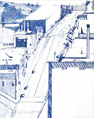
| Down 18th, Etching in Blue, 1979, Wayne Thiebaud |
![]() |
| San Francisco Study, ca 1990 |
![]() |
| Tie Rack, Cosmetic Display, Women Playing Ball, 1990 |
![]() |
| Souvenirs ca 1990 |
Wayne Thiebaud was born in 1920 in Mesa, Arizona. He moved with his family to Long Beach, California, at age nine.
Thiebaud grew up during the Great Depression. He was a boy scout and worked in restaurants.
In high school he played basketball. He took art classes and started drawing cartoons. He also worked on stage sets for theater productions. Perhaps this experience with stage lighting gave him the idea to put bright light in his paintings.
As a teenager Thiebaud held several jobs, making posters for a movie theater and painting signs. One summer Thiebaud worked in the animation department at the Walt Disney Studios. He drew the "in-between frames" (drawings positioned between key changes in movement in order to make animation play smooth) for such cartoons as Goofy and Pinocchio.
In the 1940s, Thiebaud went to junior college and then served in the Army as an artist and cartoonist. He married and settled in Los Angeles and worked as a commercial artist and illustrator. At age twenty-nine he went back to college and received degrees in art, art history, and education. He began teaching art to college students and decided to become a serious painter himself.
In 1961, Thiebaud's food paintings—images of cakes, pies, candy, gumball machines, and deli counters painted with thick paint in bright colors—were exhibited in New York. They were a big hit! Though some scholars called Thiebaud a Pop artist because he painted popular consumer goods, he said he painted them out of nostalgia; they reminded him of his boyhood and the best of America.
"My subject matter was a genuine sort of experience that came out of my life, particularly the American world in which I was privileged to be . . . . I would really think of the bakery counters, of the way the counter was lit, where the pies were placed, but I wanted just a piece of the experience. From when I worked in restaurants . . . [it was] always poetic to me."
Thiebaud painted things other than food. He made still lifes of neckties, eyeglasses, lipsticks, even cows and dogs. He also painted large portraits of human figures, applying thick paint in bright colors against stark white backgrounds.
Thiebaud went on to paint cityscapes—from the steep hills of San Francisco to the colorful landscapes of the Sacramento Valley in California.
Wayne Thiebaud retired from full-time teaching in 1990. He lives in Northern California and continues to paint.
National Art Gallery Classroom
My 20 Links p 10 - Andy Goldsworthy
Andy Goldsworthy
Andy Goldsworthy, OBE (born 26 July 1956) is a British sculptor, photographer and environmentalist producing site-specific sculpture and land art situated in natural and urban settings. He lives and works in Scotland.
Artistic Style
The materials used in Andy Goldsworthy's art often include brightly-coloured flowers, icicles, leaves, mud, pinecones, snow, stone, twigs, and thorns. He has been quoted as saying, "I think it's incredibly brave to be working with flowers and leaves and petals. But I have to: I can't edit the materials I work with. My remit is to work with nature as a whole." Goldsworthy is generally considered the founder of modern rock balancing. For his ephemeral works, Goldsworthy often uses only his bare hands, teeth, and found tools to prepare and arrange the materials; however, for his permanent sculptures like "Roof", "Stone River" and "Three Cairns", "Moonlit Path" (Petworth, West Sussex, 2002) and "Chalk Stones" in the South Downs, near West Dean, West Sussex he has also employed the use of machine tools. To create "Roof", Goldsworthy worked with his assistant and five British dry-stone wallers, who were used to make sure the structure could withstand time and nature.
Photography plays a crucial role in his art due to its often ephemeral and transient state. According to Goldsworthy, "Each work grows, stays, decays – integral parts of a cycle which the photograph shows at its heights, marking the moment when the work is most alive. There is an intensity about a work at its peak that I hope is expressed in the image. Process and decay are implicit."
Goldsworthy produced a commissioned work for the entry courtyard of San Francisco's De Young Museum called "Drawn Stone", which echoes San Francisco's frequent earthquakes and their effects. His installation included a giant crack in the pavement that broke off into smaller cracks, and broken limestone, which could be used for benches. The smaller cracks were made with a hammer adding unpredictability to the work as he created it.
Rivers and Tides by Andy Goldsworthy
![]() |
| Andy Goldsworthy, graphite on paper, 2004 NGA |
Andy Goldsworthy, OBE (born 26 July 1956) is a British sculptor, photographer and environmentalist producing site-specific sculpture and land art situated in natural and urban settings. He lives and works in Scotland.
Artistic Style
The materials used in Andy Goldsworthy's art often include brightly-coloured flowers, icicles, leaves, mud, pinecones, snow, stone, twigs, and thorns. He has been quoted as saying, "I think it's incredibly brave to be working with flowers and leaves and petals. But I have to: I can't edit the materials I work with. My remit is to work with nature as a whole." Goldsworthy is generally considered the founder of modern rock balancing. For his ephemeral works, Goldsworthy often uses only his bare hands, teeth, and found tools to prepare and arrange the materials; however, for his permanent sculptures like "Roof", "Stone River" and "Three Cairns", "Moonlit Path" (Petworth, West Sussex, 2002) and "Chalk Stones" in the South Downs, near West Dean, West Sussex he has also employed the use of machine tools. To create "Roof", Goldsworthy worked with his assistant and five British dry-stone wallers, who were used to make sure the structure could withstand time and nature.
Photography plays a crucial role in his art due to its often ephemeral and transient state. According to Goldsworthy, "Each work grows, stays, decays – integral parts of a cycle which the photograph shows at its heights, marking the moment when the work is most alive. There is an intensity about a work at its peak that I hope is expressed in the image. Process and decay are implicit."
Goldsworthy produced a commissioned work for the entry courtyard of San Francisco's De Young Museum called "Drawn Stone", which echoes San Francisco's frequent earthquakes and their effects. His installation included a giant crack in the pavement that broke off into smaller cracks, and broken limestone, which could be used for benches. The smaller cracks were made with a hammer adding unpredictability to the work as he created it.
Rivers and Tides by Andy Goldsworthy
My 20 Links p. 9 - Charles Richie
I love the effective use of a restricted palette. The imagery is amplified by the effective use of well placed color and tone. The landscape can be viewed as a metaphor for the outer world and a desire to be engaged in that world. The interior is the self and the desire of that self to be unique while secure and protected. Homes are individual solidarity within a world of chaos Charles Richie
I love the use of tone with a very restricted palette. The imagery is amplified by the effective use of color and tone.
Conversation
Conversation with the Artist in his Studio
This conversation between Charles Ritchie and Richard Waller took place in the artist's studio in Silver Spring, Maryland, on Saturday, November 21, 1992, and has been edited.
How did you come to the American home and suburbia as your central subject matter?
I love the American landscape, the home and its history, and particularly our suburban architecture. I like the American sense of space, the yard, and the netherlands that grow up between houses. I came to all of this from growing up in the suburbs; to paraphrase Mark Twain, "paint what you know," and I know suburbia well. As a child, I moved with my family every two or three years, and the houses and landscape became my emotional sounding board. The solitude represented in these houses is symbolic for everyone and certainly myself.
The exhibition is subtitled "the interior landscape." How does this refer to that metaphor?
The landscape is a symbol for the outer world, the desire to engage in the world. The interior is the self and the desire to be secure and protected within the home. The phrase merges the two aspects.
And Emily Dickinson's poem "I dwell in Possibility" is central to these thoughts?
The self becomes the house, and the house is possibility, responding to the world as it happens. Dickinson's house involves both the world without and within her "Paradise." Roof and sky are interchangeable, open and closed in the same breath. The chambers, as cedars, are permeable but difficult to see through. There is an implication of moving within the space of the self. I use this imagery, particularly in the reflection pieces where interior moves out and exterior moves in.
Your journals are crucial to an understanding of your imagery and the works in the exhibition.
The idea for keeping things in book form goes back to my childhood. In grade school I made books depicting imaginary worlds. In high school I drew, wrote, and composed songs in notebooks. By 1977 I had begun my present series, which now numbers more than eighty. These books contain dream imagery and narratives, directions to a new piece or old pieces, quotations, or just things I am thinking. They are evolving into a daily sketchbook to record ideas that strike me as significant. The journals are very private. The handwriting is generally illegible to other people, a small notehand I developed to get ideas down quickly.
The journals, then, are undeniably an integral aspect of your work. What is your process?
My first step is walking around the house, passing my subjects a thousand times. Suddenly, I know "that's it," an object seen in a particular light in the atmosphere of a particular day. The idea goes into the journal. My first images are very abstract, starting only in terms of the arrangements of forms and depiction in a loose sense. When I have decided what the image will be, I think about what paper to use. Paper is a wonderfully versatile support; I can easily adjust the size and shape in relation to the image. I keep lots of pieces of paper around the house as well as work tables with watercolor. Michelangelo's seeing the subject in the stone is analogous to my seeing the image in the paper. When I have determined and adjusted the paper, a few lines of pencil establish the composition. Often I will then do studies. Adding the tones in watercolor, I refine the image with pen and ink that has been diluted to various weights. I don't add white highlights but save the white of the paper to illuminate the work. I build up an image, and the creative process goes back and forth.
When we look at your work, we see a world of tonalities with very little color.
My perception of the suburban world is subdued, but I do select. I focus on the mystery of the contrast of dark and light. Night is a favorite theme because it filters out so much. It reduces things, levels things out, creates a powerful negative space. I am fascinated by empty spaces and the spirit of things.
http://www.charlesritchie.com/
I love the use of tone with a very restricted palette. The imagery is amplified by the effective use of color and tone.
Conversation
Conversation with the Artist in his Studio
This conversation between Charles Ritchie and Richard Waller took place in the artist's studio in Silver Spring, Maryland, on Saturday, November 21, 1992, and has been edited.
How did you come to the American home and suburbia as your central subject matter?
I love the American landscape, the home and its history, and particularly our suburban architecture. I like the American sense of space, the yard, and the netherlands that grow up between houses. I came to all of this from growing up in the suburbs; to paraphrase Mark Twain, "paint what you know," and I know suburbia well. As a child, I moved with my family every two or three years, and the houses and landscape became my emotional sounding board. The solitude represented in these houses is symbolic for everyone and certainly myself.
The exhibition is subtitled "the interior landscape." How does this refer to that metaphor?
The landscape is a symbol for the outer world, the desire to engage in the world. The interior is the self and the desire to be secure and protected within the home. The phrase merges the two aspects.
And Emily Dickinson's poem "I dwell in Possibility" is central to these thoughts?
The self becomes the house, and the house is possibility, responding to the world as it happens. Dickinson's house involves both the world without and within her "Paradise." Roof and sky are interchangeable, open and closed in the same breath. The chambers, as cedars, are permeable but difficult to see through. There is an implication of moving within the space of the self. I use this imagery, particularly in the reflection pieces where interior moves out and exterior moves in.
Your journals are crucial to an understanding of your imagery and the works in the exhibition.
The idea for keeping things in book form goes back to my childhood. In grade school I made books depicting imaginary worlds. In high school I drew, wrote, and composed songs in notebooks. By 1977 I had begun my present series, which now numbers more than eighty. These books contain dream imagery and narratives, directions to a new piece or old pieces, quotations, or just things I am thinking. They are evolving into a daily sketchbook to record ideas that strike me as significant. The journals are very private. The handwriting is generally illegible to other people, a small notehand I developed to get ideas down quickly.
The journals, then, are undeniably an integral aspect of your work. What is your process?
My first step is walking around the house, passing my subjects a thousand times. Suddenly, I know "that's it," an object seen in a particular light in the atmosphere of a particular day. The idea goes into the journal. My first images are very abstract, starting only in terms of the arrangements of forms and depiction in a loose sense. When I have decided what the image will be, I think about what paper to use. Paper is a wonderfully versatile support; I can easily adjust the size and shape in relation to the image. I keep lots of pieces of paper around the house as well as work tables with watercolor. Michelangelo's seeing the subject in the stone is analogous to my seeing the image in the paper. When I have determined and adjusted the paper, a few lines of pencil establish the composition. Often I will then do studies. Adding the tones in watercolor, I refine the image with pen and ink that has been diluted to various weights. I don't add white highlights but save the white of the paper to illuminate the work. I build up an image, and the creative process goes back and forth.
When we look at your work, we see a world of tonalities with very little color.
My perception of the suburban world is subdued, but I do select. I focus on the mystery of the contrast of dark and light. Night is a favorite theme because it filters out so much. It reduces things, levels things out, creates a powerful negative space. I am fascinated by empty spaces and the spirit of things.
http://www.charlesritchie.com/
My 20 Links p. 8 - Walter Shirlaw
Sketchbook, ca. 1859
http://www.aaa.si.edu/collections/images/detail/sketchbook-6083
Physical Details: 1 v. ; 11 x 18 cm.
All Sketchbook images below are by Creator: Walter Shirlaw, artist
Description: [Sketchbook], ca. 1895 / Walter Shirlaw, artist. 1 v. : watercolor ; 11 x 18 cm. Dorothea A. Dreier papers, 1887-1916. Archives of American Art.
A canvas-covered sketchbook, with approximately 33 pages, containing figure and landscape studies in graphite and watercolor. Images include some Biblical and possibly mythological themes. Most of the studies are signed WS.
http://www.aaa.si.edu/collections/images/detail/sketchbook-6083
My 20 Links p. 7 - William Michael Harnett
These images are from Harnett's 1870 sketchbook.
Sketchbook, 1870
Physical Details: 1 v. : graphite ; 14 x 19 cm.
Creator: William Michael Harnett, artist
Description: 15 p. There are sketches on many of the pages’ versos and on the inside of both the front and back covers. Entire book is dedicated to sketches of decorative patterns for silver flatware. In addition, there are 3 studies of heads on the inside of the back cover.
Condition: Front and back covers have almost separated from sketchbook. Pages are becoming brittle and are starting to become unbound. Water stains are apparent on the front cover and throughout the sketchbook.
Forms part of: William Harnett sketches 1870
Citation: Sketchbook, 1870. William Harnett sketches, Archives of American Art, Smithsonian Institution. http://www.aaa.si.edu/collections/images/detail/sketchbook-3372
Harnett was however a painter, specifically he painted Trompe l'oeil paintings.
There is a direct correlation between the sketchbook images and the type of painting the artist did particularly in the door hinges and tapestry designs.
![]() |
| Sketchbook, graphite, 1870, William Michael Harnett |
![]() |
| Sketchbook, graphite, 1870, William Michael Harnett |
![]() |
| Sketchbook, graphite, 1870, William Michael Harnett |
Sketchbook, 1870
Physical Details: 1 v. : graphite ; 14 x 19 cm.
Creator: William Michael Harnett, artist
Description: 15 p. There are sketches on many of the pages’ versos and on the inside of both the front and back covers. Entire book is dedicated to sketches of decorative patterns for silver flatware. In addition, there are 3 studies of heads on the inside of the back cover.
Condition: Front and back covers have almost separated from sketchbook. Pages are becoming brittle and are starting to become unbound. Water stains are apparent on the front cover and throughout the sketchbook.
Forms part of: William Harnett sketches 1870
Citation: Sketchbook, 1870. William Harnett sketches, Archives of American Art, Smithsonian Institution. http://www.aaa.si.edu/collections/images/detail/sketchbook-3372
Harnett was however a painter, specifically he painted Trompe l'oeil paintings.
![]() |
| Still Life with Bust of Dante, Oil on panel, 1883, William Michael Harnett, American 1848-1892 currently housed at the High Museum in Atlanta, Georgia |
Subscribe to:
Posts (Atom)